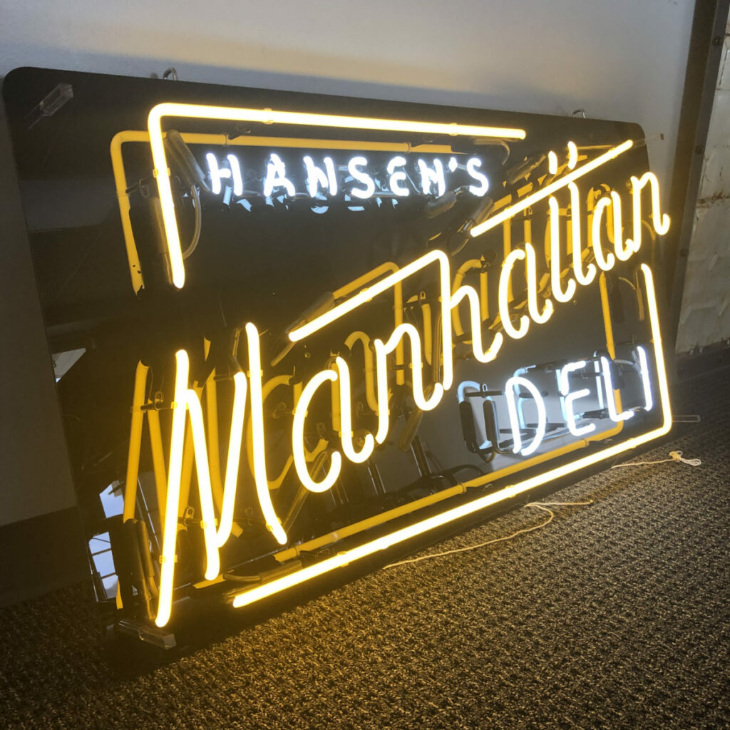
Re-Brand new for 1982
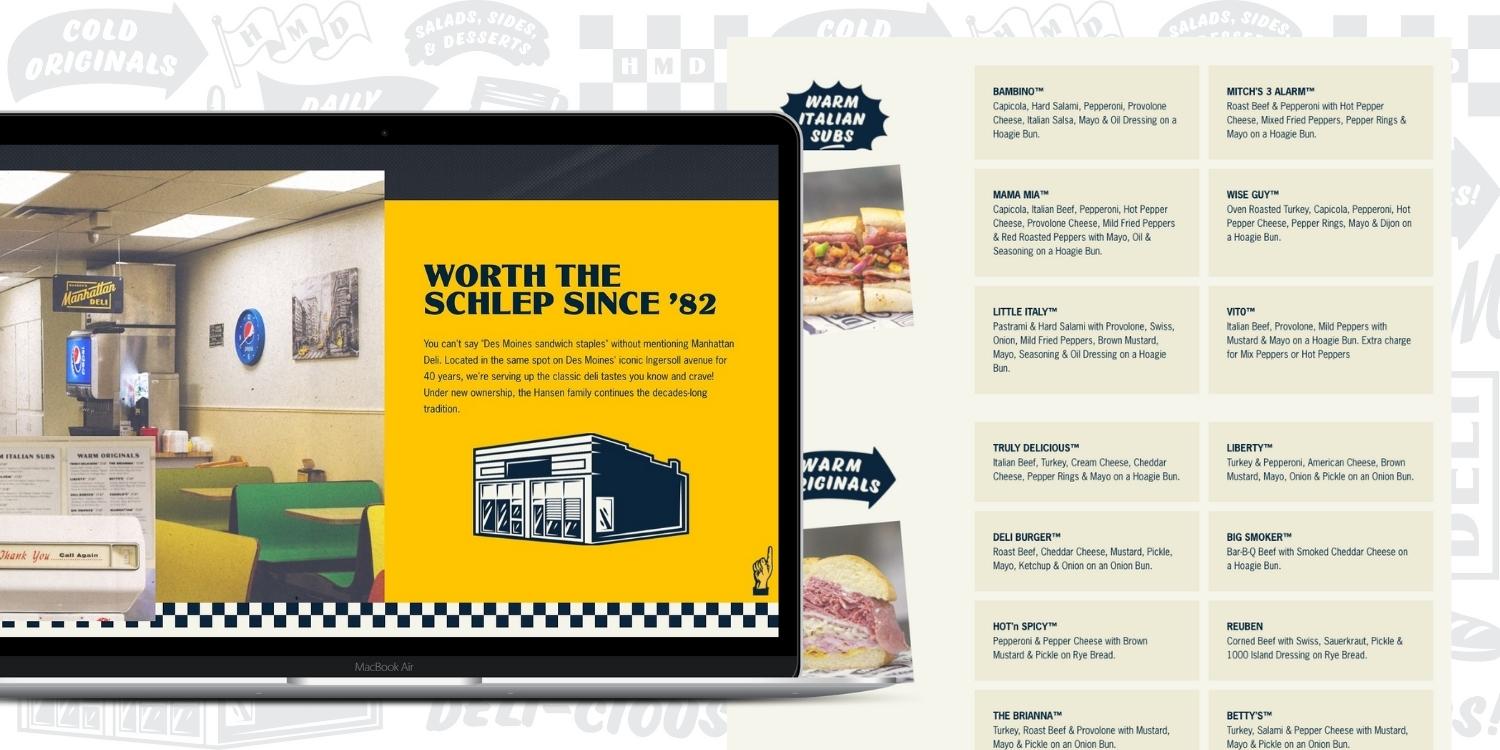
Worth The Schlep
New owners, new look, but same great flavor. Taking a “time capsule” approach, the client wanted their tiny-but-mighty sandwich shop to look like it was plucked straight from 1980s NYC.
Bold look to match the flavors
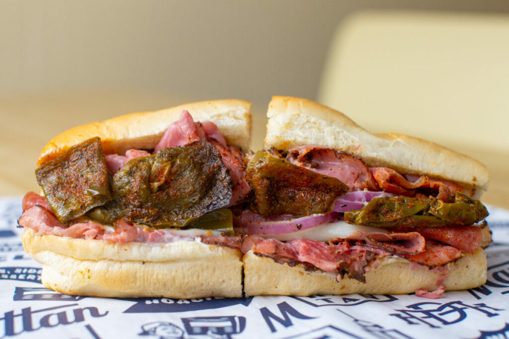
Like any good sandwich, the meat is great but sometimes it’s the toppings that put it over the top.
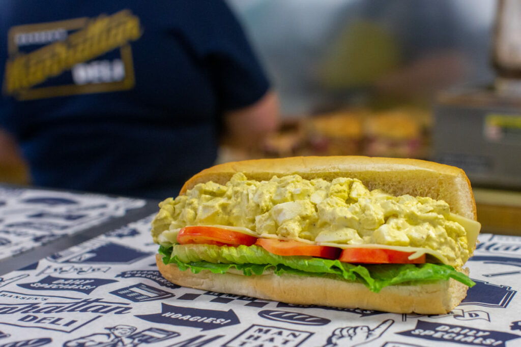
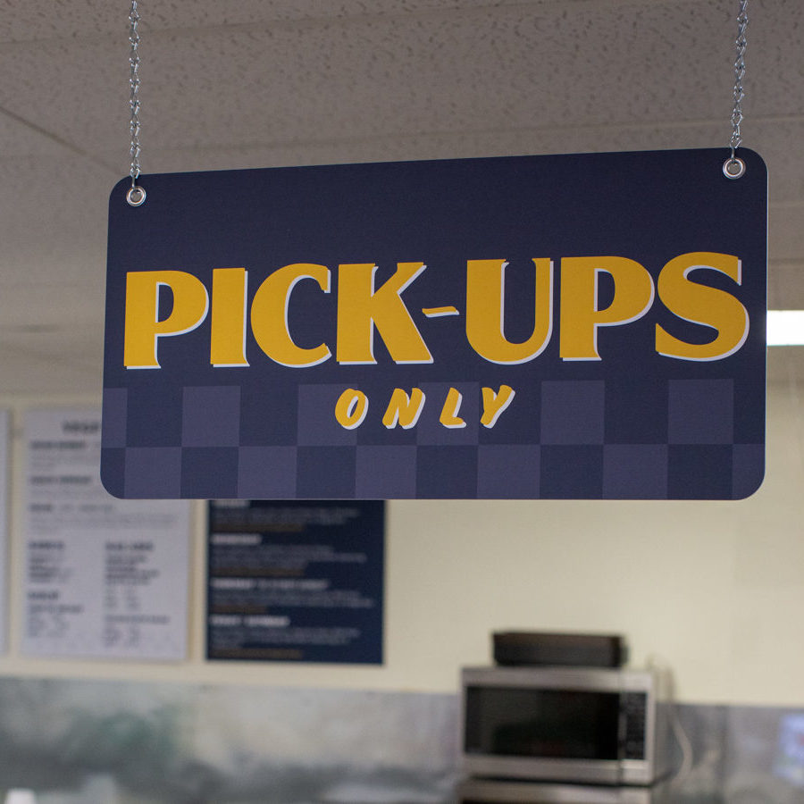
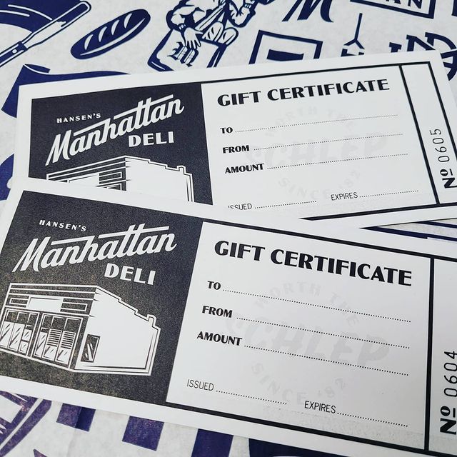
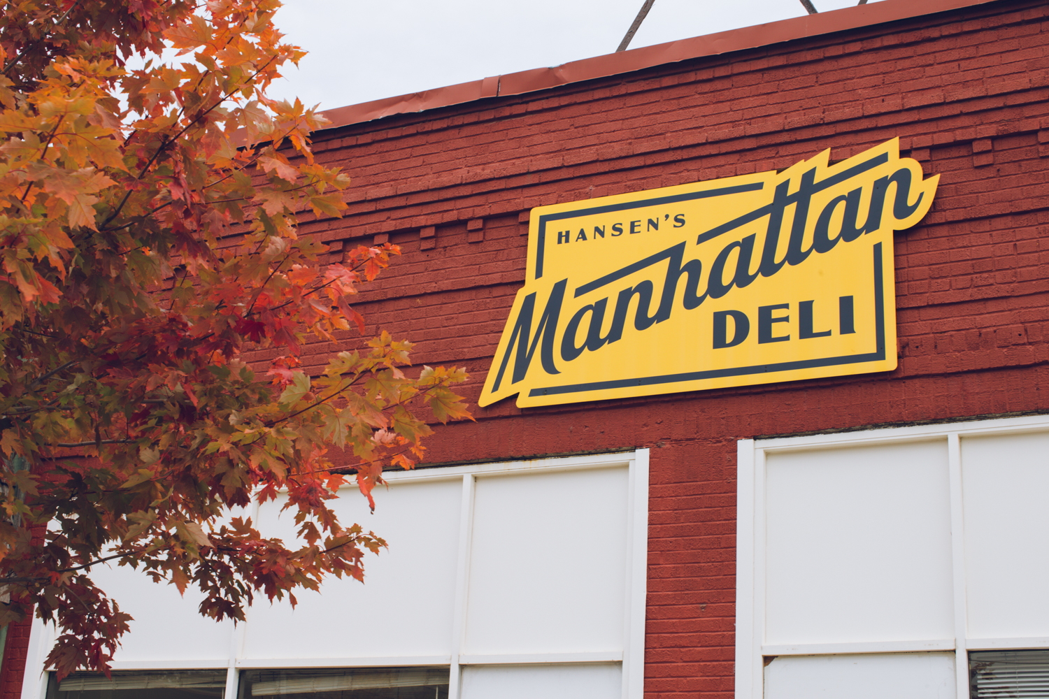
We created bold and largely hand-drawn elements that help create endless assets for the deli including sandwich paper wraps, apparel, signage, and more!
